Case Study:
Powder Days
The goal of this case study was to truly understand diverse user experience problems snowboard mobile apps have, and ultimately, to solve these issues by designing more accessible and user friendly interfaces.
ROLE
TEAM
Self-Directed
Snowboard advocates
CLIENTS
YEAR
April 2022
Research
Usability Studies
Wireframes
User flows
Prototypes
Mockups
Ideation
Snowboarding apps in general have many issues with their complexity, such as their unmotivating and complicated In-app product purchasing process, and their unclear design language.
Design Challenge
01
Understanding
The User
User research
Personas/Problem statements
User journey maps
i
USER RESEARCH
Research made it clear that users find many snowboarding websites to be overwhelming and confusing to navigate (specifically the checkout process & product filtering).
Pain Points
Navigation
Designs are often “busy”, which results in confusing navigation.
1
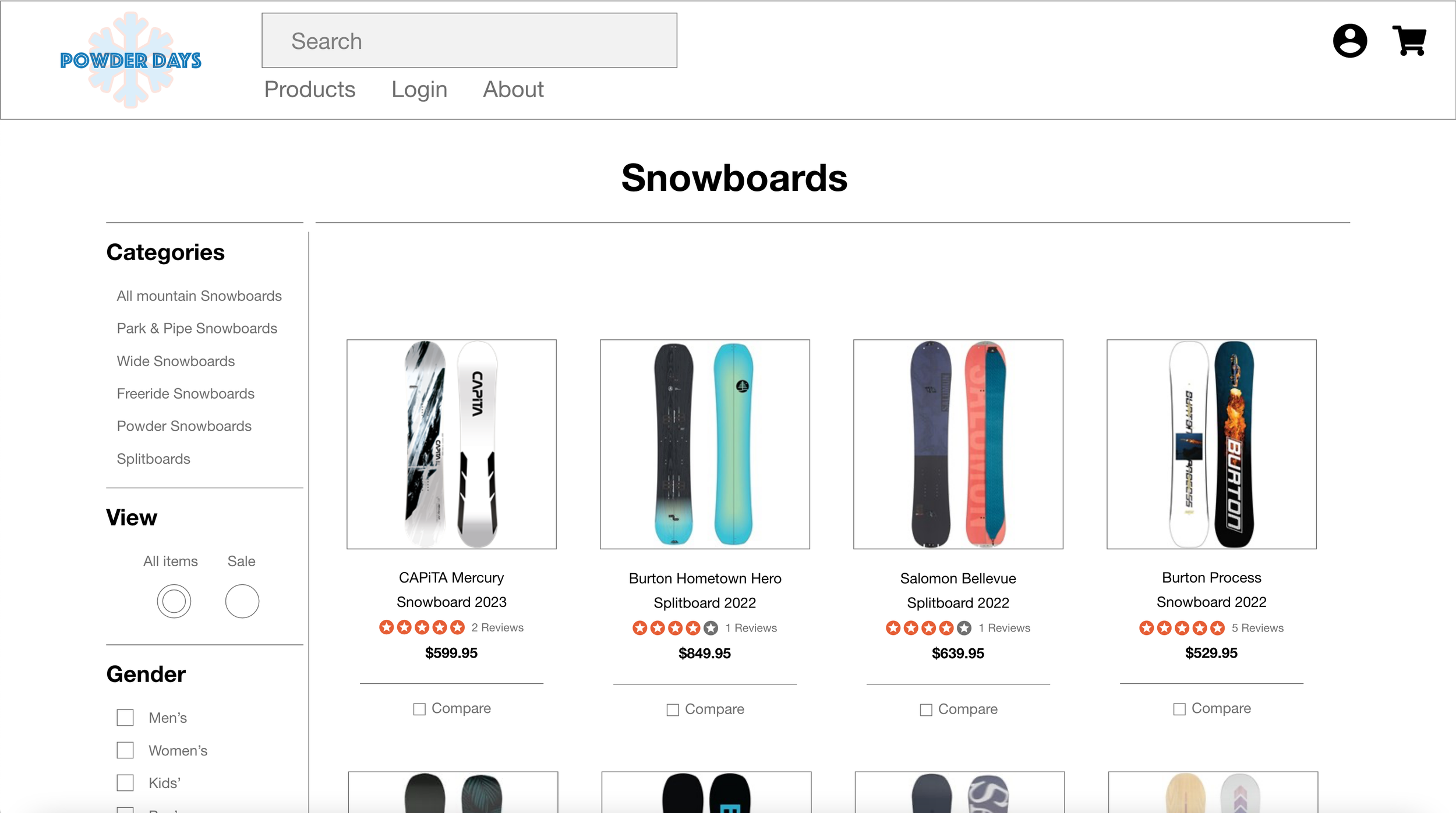
Small product images which make item selection difficult; which leads to users frustrated.
2
Interaction
Don’t provide an engaging browsing experience for new releases.
3
Experience
ii
PERSONA
Problem Statement
Chad is a busy college student who needs intuitive website navigation and appropriately sized images of snowboards because they want online shopping to be simple and relaxing.
Goals
Access to new snowboard releases each season
Easy layout for navigation
Big clear pictures of snowboards
Bio
Chad is a 21 year old college student in Environmental Studies. He lives with roommates and goes snowboarding every season in order to relieve stress but also is his passion.
His frustration comes from the website layout, messy navigation systems, and lack of appropriately sized images.
Frustrations
Snowboard images aren’t big & clear
Messy navigation with too many menu drop down options
“Would love to enjoy browsing snowboards as much as I enjoy shredding on them.”
iii
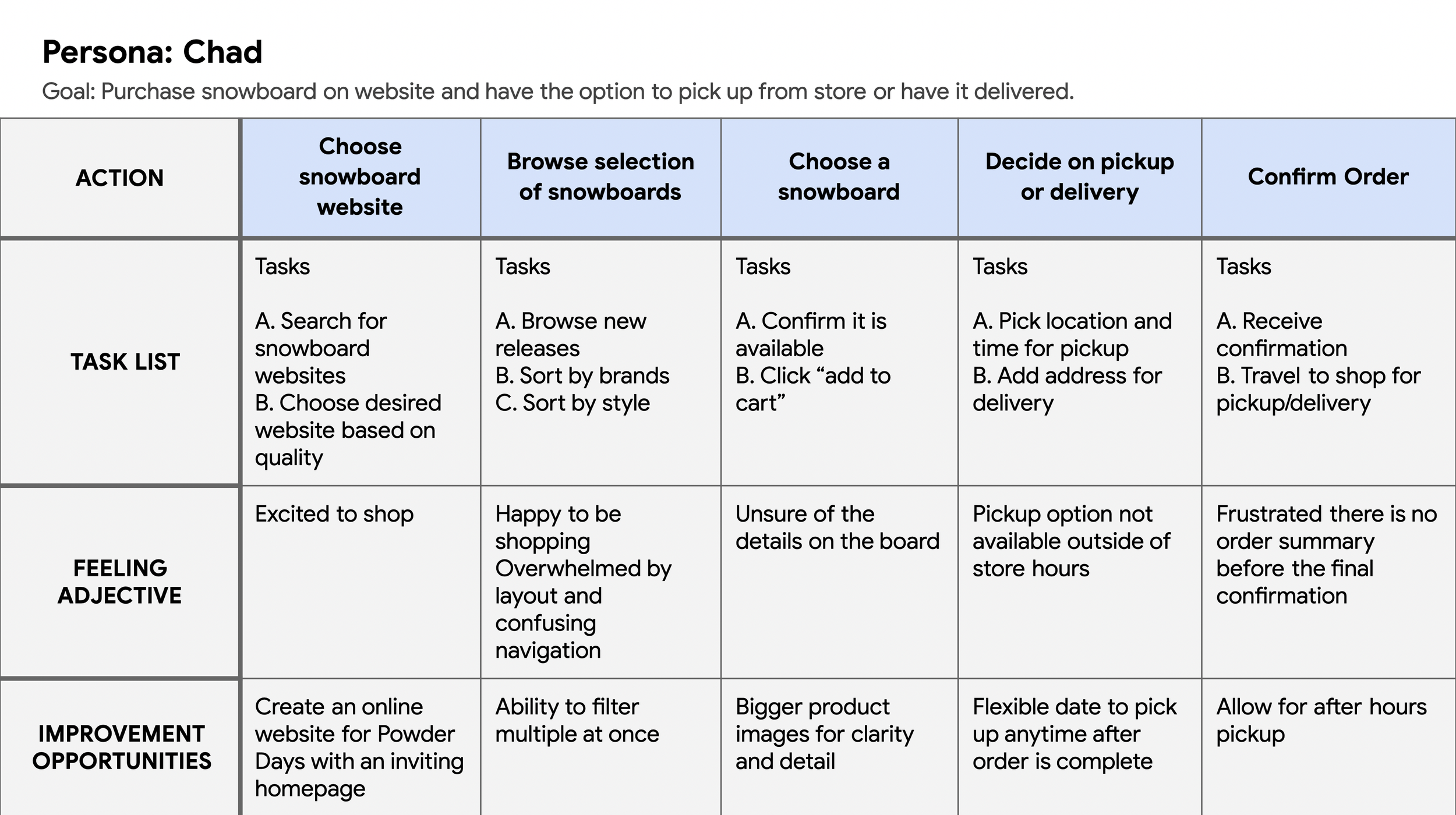
USER JOURNEY MAP
Chad’s experience using the site to help identify possible pain points and improvement opportunities.
02
Starting
The Design
Sitemap
Wireframes
Low-Fidelity Prototype
Usability Studies
i
SITEMAP
Navigation on most sites had poor informational architecture. The structure chosen was designed to make navigation simple and intuitive.
ii
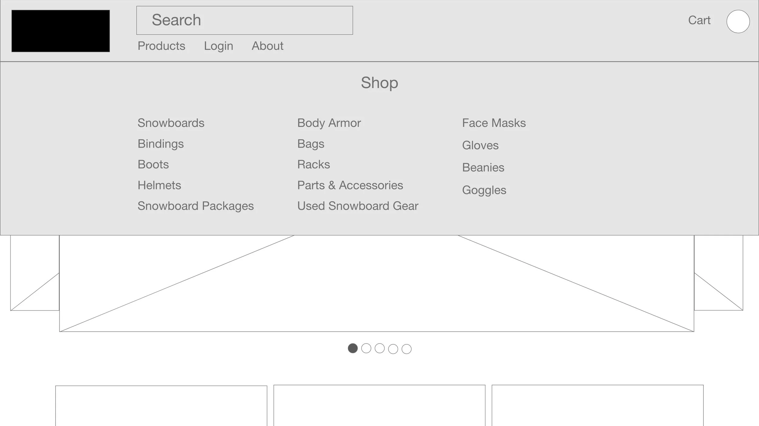
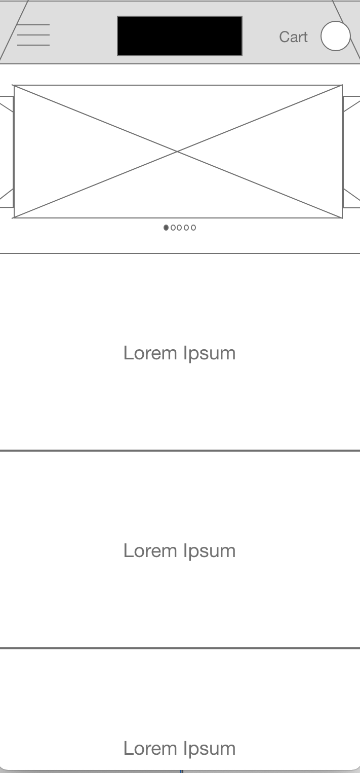
WIREFRAMES
User pain points concerning navigation, browsing, and checkout flow were in mind when considering designing the wireframes.
iii
LOW-FIDELITY PROTOTYPE
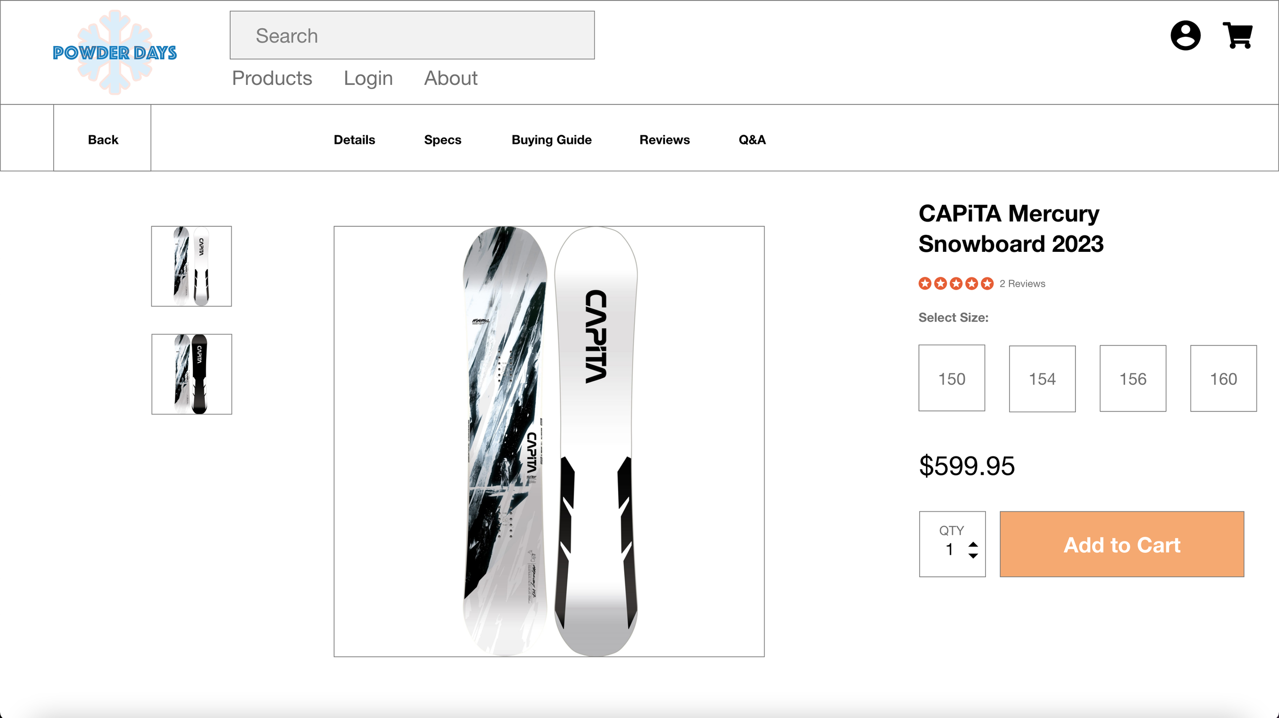
The screens involved the primary user flow: browsing, deciding, adding to cart, and checking out.
Based on feedback from the usability tests, buttons and page organization were rearranged. Several suggestions were implemented that addressed user pain points.
iv
USABILITY STUDY
Parameters set & findings discovered for the usability study.
Parameters
Moderated Usability Study
Study Type
United States, In Person
Location
5 Participants
Participants
20-30 Minutes
Length
Findings
Checkout
“Shop” button on both the hero page & homepage confused users and couldn’t locate products list.
1
Button
Users weren’t able to choose between a delivery or pick up option
2
During the checkout process, there wasn’t a clear way for users to log into their accounts to pre-fill previous billing and shipping info
3
Account
03
Refining
The Design
Mockups
High-fidelity prototype
Accessibility
Final Look
i
MOCKUPS
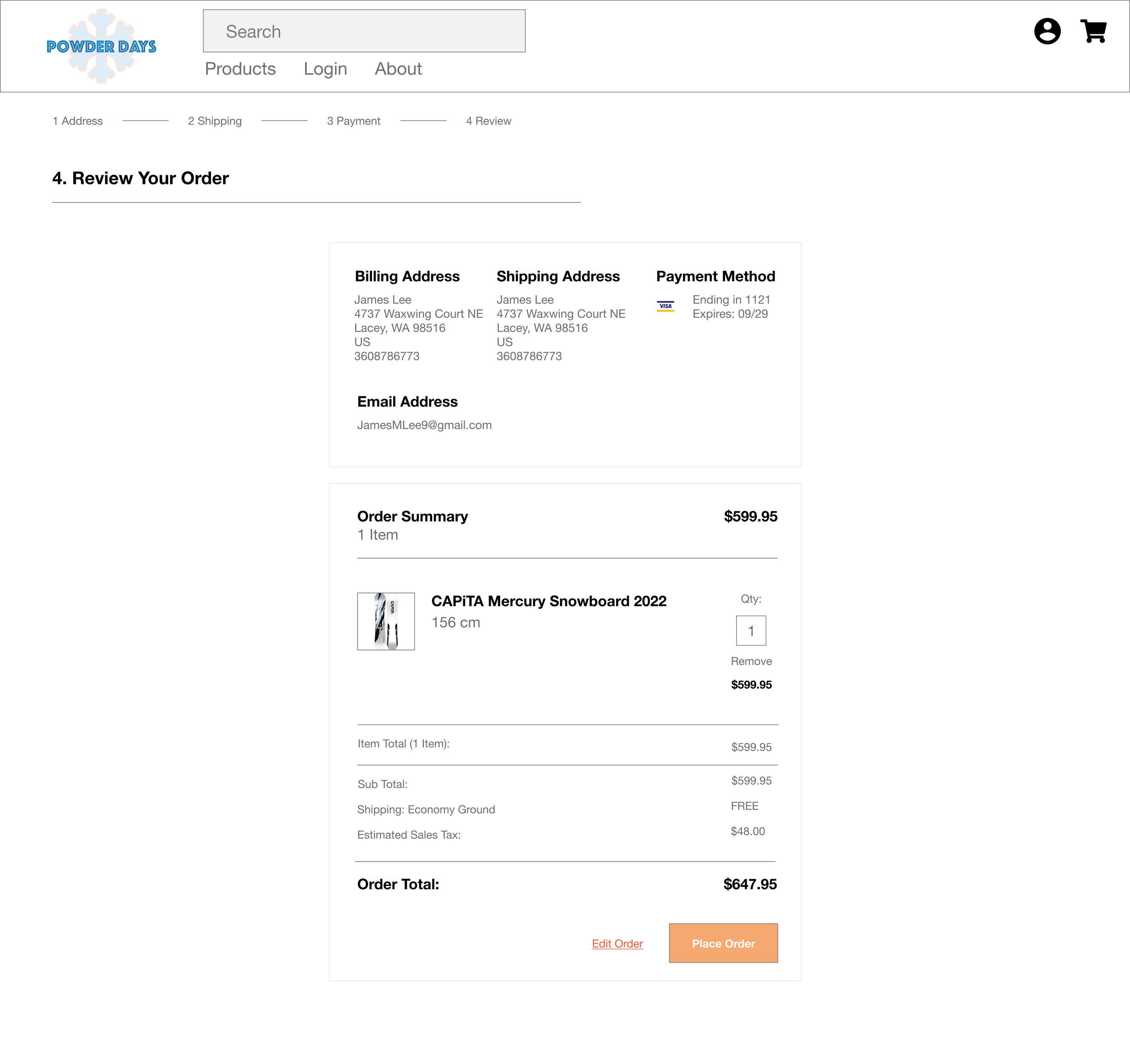
Based on the insights from the usability study three changes were made.
Informational language was altered in order to more clearly navigate to the products page.
Added checkout and pick up options.
Easy access to profile login during checkout process.
ii
HIGH-FIDELITY PROTOTYPE
The screens involved the primary user flow: browsing, deciding, adding to cart, and checking out.
Based on feedback from the usability tests, buttons and page organization were rearranged. Several suggestions were implemented that addressed user pain points.
iii
ACCESSIBILITY CONSIDERATIONS
1
2
Landmarks to help users navigate the site, including users who rely on assistive technologies
Headings
Headings with different sized text were used for clear visual hierarchy.
Landmarks
iv
FINAL LOOK
04
Going
Forward
Takeaways
Next Steps
i
TAKEAWAYS
I learned that even a small design change can have a huge impact on the user experience. The most important takeaway for me is to always focus on the real needs of the user when coming up with design ideas and solutions.
Impact
Our target users shared that the design was intuitive to navigate through, more engaging with the images, and demonstrated a clear visual hierarchy.
What I Learned
ii
NEXT STEPS
1
2
Identify any additional areas of need and ideate on new features
Usability Study
Conduct follow-up usability testing on the new website
Features
Prev.


